“Perception vs. Reality.” This is a phrase that comes up a lot in work and life, and trust me, as a design director, I could get all philosophical on you, but why bore you? Instead, let’s have fun!
As a creative, I REALLY love to look at design eye candy. And when an artist crosses my path that shocks me, in a good way, well, I must share the wealth candy.
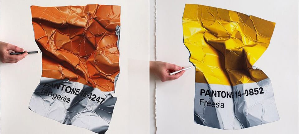
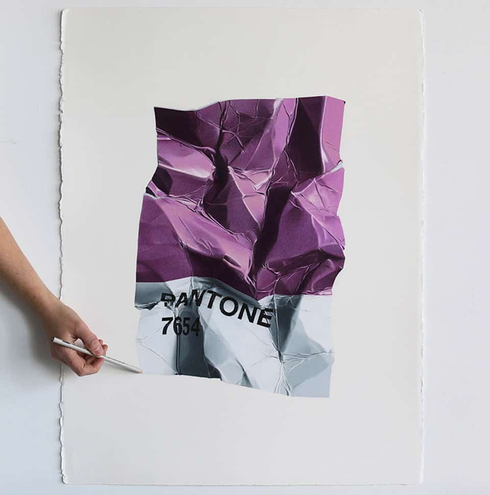
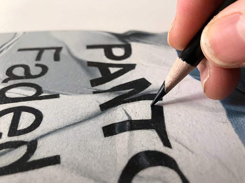
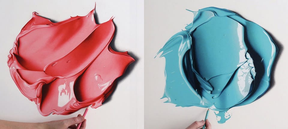
Take a close look at that blob of paint up there. Don’t you want to touch it? Is it wet? Goopy? Feel sort of like plastic? How about none of the above? This is a drawing. DRAWING. With a colored pencil. No way, right?
Look again.
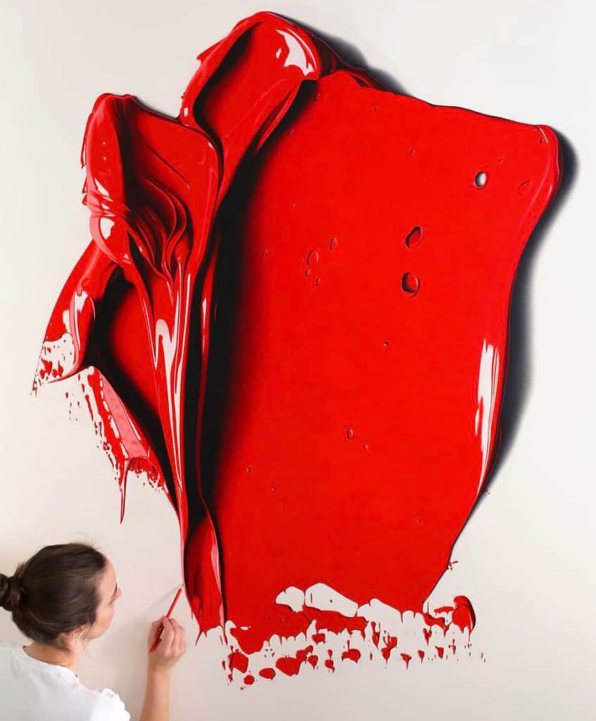
Anyone who peruses the works of CJ Hendry will be truly amazed and stunned by the photorealism of her work. You’ll be even more inspired when you learn she has no formal training, schooling, and no gallery representation.
As a designer, you’ll be smitten with her drawings of PANTONE® chips and her “Monochrome” (2018) exhibit in Brooklyn, NY.
Google “CJ Hendry,” and you will find so much color goodness, as well as some insanely realistic ink drawings.
If you think this is eye candy, follow her Instagram (@cj_hendry).
My perception: she’s the real deal.